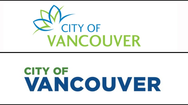
In the days following the approval of a new logo for the City of Vancouver, local graphic designers have shared polarizing opinions on social media and in an open letter to city staff.
The logo was voted on in a city council meeting Wednesday, approved by a vote of seven to two. The city says it will be rolled out over time, as branded items like signs, business cards, pamphlets and vehicle decals need to be replaced.
The design was commissioned by the city to the lowest bidder, local firm Hangar 18 Creative, for a price of "less than $8,000," according to a report filed last week.
The approved wordmark has been polarizing, with many members of the public criticizing its simplicity – something the city requested of the designer in hopes that the chosen wordmark would be legible even in a small format, like on a cellphone.
The new logo (bottom) reads "City of Vancouver" in green and blue, in the font "Gotham," which is easily accessible to the public through programs like Microsoft Word.

Some members of the public were bothered by the project's cost. Many were not specifically critical of the amount paid, which even Coun. George Affleck described as a deal before he voted against the design, but by spending they felt was unnecessary.
Critics including Affleck wondered why the city needed a new logo, while others questioned why the city didn't assign the project to one of its in-house graphic designers.
Others were bothered by the dollar amount, wondering why at a time when taxes are increasing to fight the city's opioid crisis the city was spending thousands of dollars on a new logo. Many were irked by the simplicity of the design as well, including one person who told CTV News their eight-year-old child could have designed it.
But the online voices that were loudest this week, both in favour and against the logo, were those from the graphic design community.
Messages poured in through Twitter to the city, councillors and members of the media saying that the logo design process was not as simple as they felt it was being portrayed.
Some pointed out that copies made through programs like Word, posted to social media by members of the media and the public, did not have the same kerning, colouring, leading and other things that a professional would notice and fix but an amateur would not.
In a message directed to CTV, an illustrator from Vancouver Island attached an image of a painting, writing: "This painting sold for $60 million. Just because you don't understand what makes it 'work' doesn't mean it's wrong."
They wrote that copying or recreating a logo is not the same as filling a blank space, coming up with an original idea, or working within the restraints imposed by a client. Others posted about the need to support local artists and designers, and that the price was actually fairly low for an original design.
Other designers were critical of what they felt was a missed opportunity by a city trying to be seen as design-savvy.
Dozens of people identifying themselves as members of Vancouver's design and digital community added their names to an open letter to the city published Friday by art director Brock Ellis.
The letter, addressed to the mayor and council, describes Vancouver as a city "bursting at the seams with creativity and talent."
It mentions two of the city's nicknames, "Hollywood North" and "Silicon Valley North," monikers earned because "Vancouver's creative and innovation sectors are world-renowned for our skills."
The letter goes on to say that those who have added their signatures are "deeply disappointed" in Wednesday's decision, "and specifically the misguided process that was undertaken for this approval."
Signees said they were troubled by the city's decision to reduce the process to "an administrative communications exercise," and said staff "severely failed to produce an inspirational mark" that represents Vancouver.
Those behind the letter said they are also troubled with the city's decision to go to the lowest bidder, and by its low budget and lack of comprehensive plan for the logo's rollout.
"On one hand, the City publicly touts the importance of creative and innovation economies in Vancouver, and justifies the development of these sectors as a primary motivation for this exercise," the letter says.
"On the other hand, when it comes to redeveloping the identity for a city of our size, the City chooses to severely underinvest resources and time. To us, this signals that the City actually undervalues design and the creative and innovation sectors thereby setting an undesirable precedent for the future."
Thirdly, the letter says, those who have signed are confused about the reason behind the logo redesign. It says they don't believe the new logo meets the criteria outlined in the city staff report: That it can be easily recognized by even those who do not speak English, and that it is easily adaptable.
Finally, signees said they're bothered by the fact that print material had been distributed prior to the council vote, as reported by CTV News.
Although its rollout wasn't officially approved until Wednesday, CTV Vancouver's Penny Daflos learned that it was actually in use at least a week before council approval, and some members of city staff already had business cards touting the design. Pamphlets were also in circulation at City Hall the day of its approval, already sporting the new wordmark.
Sooooo this is interesting. @CityofVancouver said they'd phase in new logo as items need replacing, but I just got this at info counter. pic.twitter.com/cGTpa99MP5
— Penny Daflos (@PennyDaflos) February 23, 2017
Ok, tweeps. A WEEK before @CityofVancouver council approved logo rollout, staff already using it. Is that acceptable to you? @CTVVancouver https://t.co/GhJxhGyVf6
— Penny Daflos (@PennyDaflos) February 24, 2017
"This isn’t about whether a municipal logo redesign should be approved by City Council or not. This is about the integrity of our civic democracy. You have undermined democracy — a core Canadian value."
A representative of the city said the issue up for debate on Wednesday was whether to authorize the rollout of the new wordmark, not to approve the logo itself.
"Further, staff have been preparing designs for a number of items in preparation for that roll out," Jag Sandhu told CTV News on Friday.
"Some smaller communications pieces may have been sent to print but staff were asked to pull back about three or four weeks ago."
Those who have signed the letter are urging council and the city itself to reject the new wordmark, calling it an "insult to Vancouverites and all who love our city."


