Feb. 24 update: Graphic designers speak out in favour and against new city logo. Read the latest story here.
City signs are getting a makeover after a simplified new logo was approved by Vancouver councillors at a meeting Wednesday.
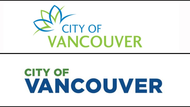
The logo was revealed in a city staff report written last week, and is a simplified version of the current logo but uses slightly different shades of green and blue. The font is bolder in the new design, and the floral element in the top left of the old logo is gone.
At the meeting, staff said the simplified design was intentional, and meant to be more legible in small formats like cellphone screens, specifically on social media.

During Wednesday's meeting, fellow NPA Coun. Melissa De Genova said she'd been sent several versions members of the public had recreated on their own, and wondered about the consultation process behind the design. She said she herself was able to replicate the logo using Microsoft Word and wondered why the design cost the city $8,000, and why it wasn't done in house.
Director of Corporate Communications Rena Kendall-Craden responded that the design was more than just selecting a font, and that those hired in the contract had first identified the qualities they wanted it to represent. They also had to figure out what would be legible on small screens.
"It was a process, rather than a selection of a font. We played with a lot of options," she said, adding that the selection was made from "about eight to 14 options" put forward to staff.
"This was the one that stood out to us and gave us the most flexibility."
Following councillors' questions, the mayor said he personally liked the new design.
"I think it's bolder and brighter and cleaner. I think it will serve our city well for the immediate future," Gregor Robertson said. He said the project was completed "quickly and cost-effectively," calling the project "very inexpensive for what we're getting."
He called the current logo "lame," and described it as "bland… with a squiggly thing on it that doesn't really mean anything to anyone."
Robertson thanked staff for their work on the design, which was then approved by a vote of seven to two.
The selection is very similar to the logo used by the City of Chilliwack, which follows the same text alignment but also includes an illustration of mountains on the left. Chilliwack's logo was designed following the creation of a task force in 2010 by a local firm called "Basecamp Creative."

The City of Vancouver has had the same logo for more than 10 years, and part of the idea behind the project was to create a new brand that is easily recognizable.
City staff asked the creative agency that offered the lowest bid on the contract to design something that would be clearly legible on municipal signage, social media accounts, websites and other places.
They also asked that the design be simplified so it is recognizable and understandable to those in the city for whom English is not a first language. More than half of Vancouver's population has a first language other than English, according to the 2016 "Quality of Living Index."
The total costs came in under $8,000, the report says, but the exact amount has not been made public. If approved, it will be phased in gradually over the next year, starting with new materials then updating older signage and other materials as they are replaced "to minimize costs."
Kendall-Craden said they haven't priced out what the entire rollout will cost, but said it would start with business cards and be incorporated with changes that would already take place due to general wear and tear.
But she said she knew that the large signs welcoming people to the city, of which she estimated there are six, will cost about $25,000 each to replace. She said the signs are not in the budget for this year, and didn't have a specific date or plan.
Ok, tweeps. A WEEK before @CityofVancouver council approved logo rollout, staff already using it. Is that acceptable to you? @CTVVancouver https://t.co/GhJxhGyVf6
— Penny Daflos (@PennyDaflos) February 24, 2017
"With all due respect to the designer, it appears that they went, found a font and typed it out, and put some colour to it, and we have a new logo for $8,000," Coun. George Affleck said.
He said the price is a "pretty good deal, I suppose," but that he's concerned about the cost associated with replacing the current logo, and whether it was necessary in the first place.
Regardless of whether the change was necessary, the project's initial price tag is much lower than a temporary rebrand the city paid for in 2009, meant to be used as its logo during the Olympics.
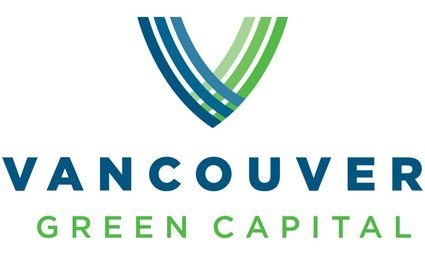
A city logo touting Vancouver as the "green capital" left the city with a bill of $239,000 before tax, according to documents obtained by 24 Hours Vancouver under the Freedom of Information Act. On Wednesday, the mayor said he liked that the 2017 logo "ties in closely" with the logo used during the Olympics by using a similar colour scheme.

And Vancouver isn't the first city to make headlines over logos. The same year Vancouver revealed its costly "green capital" branding, the City of Kelowna faced copyright issues over its new logo.
That city spent more than $35,000 on public consultations before selecting a logo meant to mimic the natural beauty of the Okanagan, but the selection was very similar to that of an American real estate company. Ultimately, the logo was permitted and is still in use by the municipal government.
In Vancouver, staff said the wordmark up for voting on Wednesday has already been registered with the registrar of trade marks as an official mark in Canada.
Several designs were considered for Vancouver's rebrand, but the final design was in the city's new official font – Gotham – and uses Pantone 363 for the green "City of" text, and Pantone 2945 for the blue "Vancouver" text. There are also black and white versions to be used when full colour isn't an option.
The city's previous logo used the font Optima.
The report says the simplified logo "presents an updated image of the City of Vancouver as a modern, innovative and highly desirable place to live and work."
But some members of the public weren't impressed with the design.
"My eight-year-old could do that," one person told CTV News.
"I like the old one. I think I'd rather them spend (the money) on something else," another said.
A third called the logo "boring," and another person just laughed.
The logo was discussed at the city's monthly "Policy and Strategic Priorities" meeting, starting at City Hall at 9:30 a.m. Also on the agenda were a review of the province's approval of the Kinder Morgan pipeline expansion and an update from the mayor's task force on mental health and addictions.
The agenda and related documents are available online.
With a report from CTV Vancouver's St. John Alexander
The City of Vancouver paid $8000 for its new logo. We paid $7.95 online, for five originals. Here's one of them (more to come): pic.twitter.com/SswAsJ20Ss
— St John Alexander (@ctv_stjohn) February 24, 2017


