This interactive map shows the life expectancy in your neighbourhood compared to others in Vancouver
 A map created as part of an extensive study from UBC shows life expectancy averages by neighbourhood.
VANCOUVER -
It's considered one of the healthiest cities in the world, but an interactive map put together by local researchers shows just how much a Vancouver resident's lifespan can vary by neighbourhood.
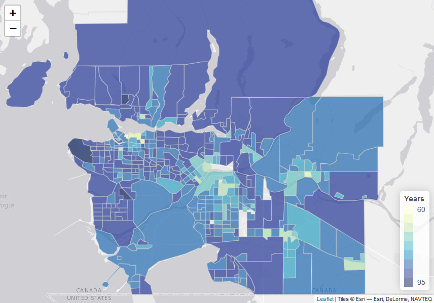
The map, published as a result of a University of British Columbia study, allows users to zoom into their own neighbourhood in Vancouver and surrounding cities, and view the average life expectancy based on census results.
For example, looking at 2016 census data, the mean life expectancy in an area that includes Vancouver's Downtown Eastside is quite low, at 60.7 years.
But in the area of the city that includes the UBC endowment lands, the mean age is just over 90.
And this filter shows how life expectancies in the region overall were much lower in 1991, than above in 2016.
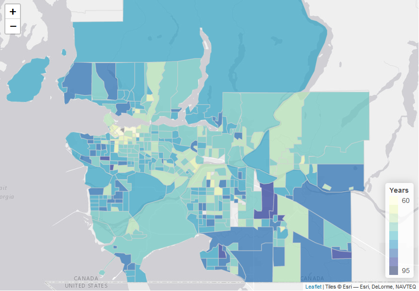
It's perhaps not surprising that overall life expectancy has increased over the period examined in the study, but it may be a surprise to see that while it's much higher in many parts of Metro Vancouver now, areas including the Downtown Eastside and Haney, in Maple Ridge, still have a life expectancy of less than 75.
"Statistically, residents of those areas have life expectancies that are comparable to the average life expectancies in Indonesia (71.8 years) and Russia (73.2 years)," UBC said in a statement.
In areas like West Vancouver, West Point Grey, northwest Richmond and South Surrey, the expectancy is much higher.
The school said it's the first study of its kind in Canada – the first to analyze life expectancy and causes of death at such a level over decades.
Users can not only check the average life expectancy in their neighbourhood according to the most recent census data (2016), but they can also look back at how it's changed, with data from 1991, 1996, 2001, 2006 and 2011.
UBC attributes some of the disparity to specific causes of death, including HIV/AIDS and sexually transmitted diseases.
"For these causes, some neighbourhoods had a mortality rate 17 times higher than others in the city," the school said.
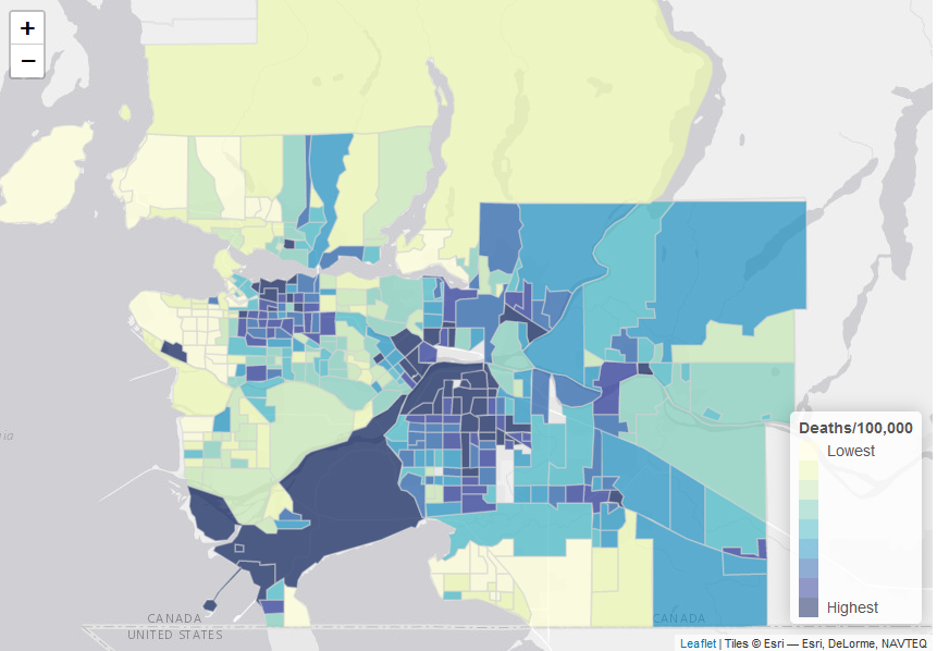
In a separate tab, they can narrow those results in another way, sorting by census year and even cause of death. The map allows users to look at the region in terms of death attributed to substance use, for example.
The image embedded below shows substance use disorder deaths per 100,000 residents, with the darkest-coloured areas having the highest rates of death, based on 2016 data.

This view of the map shows rates of death due to diabetes and kidney diseases.
More information is available on UBC's website.
All graphics are from the interactive data map created by UBC.
Shopping Trends
The Shopping Trends team is independent of the journalists at CTV News. We may earn a commission when you use our links to shop. Read about us.


CTVNews.ca Top Stories

N.Y. prosecutors charge Luigi Mangione with murder of UnitedHealthcare CEO, court records show
Late Monday, Manhattan prosecutors filed murder and other charges against Luigi Nicholas Mangione in the killing of UnitedHealthcare's CEO, according to an online court docket.
Union dropped wage demand to 19% over four years in Canada Post negotiations: CUPW
The Canadian Union of Postal Workers (CUPW) has reportedly dropped its wage demand to 19 per cent over four years, CUPW negotiator Jim Gallant told CTV News.
Taxpayer-funded Eras Tour tickets returned by federal minister
While tens of thousands of fans packed Vancouver's BC Place for the last shows of Taylor Swift's Eras Tour this weekend, a federal cabinet minister wasn't one of them.
Sudbury, Ont., family traumatized after hospital said loved one had been released, when in fact they had passed away
Sudbury resident Angela Vitiello says a staff member at Health Sciences North told her that her brother, Allan St. Martin, was released from the hospital late last month when, in fact, he had passed away.
What the upcoming holiday GST relief will mean for consumers
The federal government's GST break will arrive this Saturday, just in time for the last stretch of holiday shopping.
Liberal government survives third Conservative non-confidence vote
Conservative Leader Pierre Poilievre's latest attempt to topple the minority Liberal government in a non-confidence vote failed on Monday, thanks to the New Democrats.
Katie Holmes refutes story about daughter Suri Cruise’s fortune
Katie Holmes has posted a screen grab of a Daily Mail article, which reported that her 18-year old daughter, whose father is Tom Cruise, is now a "millionaire."
Polygamous U.S. sect leader gets 50 years in prison in scheme to orchestrate sex involving children
A polygamist religious leader in the U.S. who claimed more than 20 spiritual “wives” including 10 underage girls was sentenced to 50 years in prison on Monday.
Trudeau says dealing with Trump will be 'a little more challenging' than last time
Prime Minister Justin Trudeau said dealing with incoming president Donald Trump and his thundering on trade will be 'a little more challenging' than the last time.
Vancouver Island
-

Toxic drug deaths in October lowest in 4 years, B.C. coroners service says
Toxic drug deaths in October reached a low not seen in years, according to new preliminary data from the B.C. Coroners Service.
-
B.C. selects 9 wind power projects to boost energy supply by 8 per cent a year
British Columbia has given the green light to nine wind energy projects that will boost the province's hydro-electric grid by eight per cent a year, enough to power 500,000 homes.
-
'Bombshell': Small Business BC abruptly declares bankruptcy
A decades-old non-profit with a mandate of supporting B.C.'s small businesses abruptly declared bankruptcy – resulting in dozens of employees losing their jobs weeks before Christmas.
Kelowna
-

Study of 2023 Okanagan wildfires recommends limiting development in high-risk areas
A study into the devastating wildfires that struck British Columbia's Okanagan region in 2023 has recommended that government and industry limit development in high-fire-risk areas.
-
Kelowna, B.C., to host the Memorial Cup in the spring of 2026
The Western Hockey League's Kelowna Rockets will host the Memorial Cup in the spring of 2026, the Canadian Hockey League said Wednesday.
-
545 vehicles impounded in 332 days: BC Highway Patrol pleads for drivers to slow down
Mounties with the BC Highway Patrol in Kelowna say they've impounded more than 545 vehicles for excessive speed and aggressive driving so far this year. That works out to more than 1.6 per day.
Edmonton
-

Family spokesman says slain Edmonton security guard had only been working 3 days
A spokesman for the family of a security guard who police say was murdered while patrolling an Edmonton apartment building last week says the man had only been on the job for three days.
-
Largest AI data centre in the world to be built in northwest Alberta
The world's largest Artificial Intelligence data centre will be built in northwest Alberta and comes with an estimated $70 billion price tag.
-
Hot Oilers prepare for parade of fellow NHL titans
The upcoming schedule of the big-wheel Edmonton Oilers features four other NHL giants in a row, starting Tuesday at Rogers Place against the recent two-time Stanley Cup champion Tampa Bay Lightning.
Calgary
-

Parents charged in toddler son's death plead guilty to manslaughter
The parents accused in the death of their 18-month-old son pleaded guilty to manslaughter charges in a Calgary courtroom Monday.
-
'Ridiculous': Calgary retailers prepare for GST holiday this week
A temporary federal tax break set to start this weekend is causing confusion for Calgary retailers – and it's also coming at a cost.
-
Syrian refugees in Calgary react to fall of Assad regime with joy, trepidation
There's joy and trepidation among Syrian refugees in Calgary in the aftermath of the ousting of the Assad regime in that country.
Lethbridge
-

Lethbridge Hurricanes drop off donations at Chinook Regional Hospital
Members of the Lethbridge Hurricanes visited the Chinook Regional Hospital on Monday to help deliver thousands of teddy bears collected during Friday's game against the Medicine Hat Tigers.
-
'Go beyond the board': Chess helping Alberta youth keep troubles in check
Every Friday in a southern Alberta classroom, youth are learning how to keep their troubles in check.
-
Hurricanes rally for 4-3 victory over Tigers on Teddy Bear and Toque Toss night
It took the Lethbridge Hurricanes a period to get going Friday night, but once they did, VisitLethbridge.com Arena was raining teddy bears and toques as the Hurricanes defeated the Medicine Hat Tigers 4-3.
Winnipeg
-

Here's how much snow fell in parts of Manitoba Sunday
A low pressure system brought snow, freezing rain and freezing drizzle to much of southern Manitoba starting Sunday.
-
Some small businesses concerned about making changes to comply with GST holiday
As the federal government prepares to lift the GST on a laundry list of items on Saturday, some small businesses are concerned making it happen will be a huge problem.
-
11 train cars derail, closing Manitoba road for hours
A train derailment near Portage la Prairie had traffic closed for several hours and almost a dozen railcars completely off the tracks.
Regina
-

Province reviewing work environment in Regina hospitals following alleged misconduct
The Government of Saskatchewan is mounting a work environment review for physicians in Regina following allegations of racism, misconduct, and a lack of professionalism.
-
Sask. Court of Appeal denies White City's request to annex 4,000 acres from RM of Edenwold
A land dispute that's been taking place just east of Regina for the past six years has been put to rest, according to the Rural Municipality (RM) of Edenwold.
-
Icy roads and streets an issue after thaw, freezing rain hits Saskatchewan
A mixture of rain and snow hit many parts of Saskatchewan over the weekend, leaving roads and sidewalks covered in ice.
Saskatoon
-

Emergency crews searching the South Saskatchewan River for body of missing man
Saskatoon police and firefighters have begun searching the South Saskatchewan River for the body of a 48-year-old man who went missing late last month.
-
Sask. RCMP lay murder charge in fatal February shooting
The Saskatchewan RCMP have charged a man with first-degree murder for a fatal February shooting in North Battleford.
-
Sask. hockey player recovering after near fatal skate accident during game
The Sask East Hockey League (SEHL) has released details of a near fatal accident at one of its games over the weekend – which saw a Churchbridge Imperials player suffer serious injuries after being struck with a skate.
Toronto
-

A 'traffic crisis': Economic, social impact of congestion cost Ontario more than $50B in 2024, study finds
The cost of lost economic opportunities in the GTHA due to congestion totaled more than $10 billion in 2024 and that number rose to more than $47 billion when factoring in the “social impacts” that diminish a commuter’s quality of life, according to a new report.
-
East Toronto shooting victim was a 'loving mother, daughter, cousin and niece,' says her mother
A 34-year-old woman fatally shot inside of a home in Toronto's east end on Sunday evening was a 'loving mother, daughter, cousin and niece,' says her mother.
-
N.Y. prosecutors charge Luigi Mangione with murder of UnitedHealthcare CEO, court records show
Late Monday, Manhattan prosecutors filed murder and other charges against Luigi Nicholas Mangione in the killing of UnitedHealthcare's CEO, according to an online court docket.
Montreal
-

'Looking for the Weinstein of Quebec': impresario Gilbert Rozon's civil trial begins
Just for Laughs founder Gilbert Rozon's civil trial for sexual assault opened Monday at the Montreal courthouse with his lawyer portraying him as the scapegoat in a hunt to find Quebec's Harvey Weinstein.
-
Montreal man retiring early after winning half of the $80 million Lotto-Max jackpot
Factor worker Jean Lamontagne, 63, will retire earlier than planned after he won $40 million on Dec. 3 in the Lotto-Max draw.
-
Search for Quebec hiker missing in Adirondacks now likely a recovery mission
Authorities in New York state say the search for a 22-year-old Quebec hiker who went missing in the Adirondacks more than a week ago is now likely a recovery mission.
Ottawa
-
 FREEZING RAIN WARNING
FREEZING RAIN WARNING Freezing rain and drizzle to coat Ottawa with ice
A freezing rain warning was issued for Ottawa Monday evening after a snowy afternoon. Environment Canada is warning of ice buildup on roads, sidewalks and other surfaces.
-
Treasury Board president accuses PSAC of sharing 'misleading information' on $1.9 billion public service pension surplus
The President of the Treasury Board is accusing a federal public service union of providing "misleading information" to its members, after the Public Service Pension Fund posted a non-permitted surplus of $1.9 billion.
-
OPP deal with collisions across eastern Ontario as wintry weather makes roads icy
Ontario Provincial Police have reported several collisions around eastern Ontario Monday as a wintry storm brings snow, freezing rain and freezing drizzle to the area.
Atlantic
-

Eastern Canada storm to impact Maritimes with high winds Thursday
An area of low pressure is forecast to develop into a strong storm as it moves from the northeastern U.S. into the St. Lawrence River Valley late Wednesday into Thursday.
-
New report states cancer comes at a high physical and financial cost to Canadians
A new report from the Canadian Cancer Society states, on average, a Canadian with cancer pays $33,000 out of their own pocket.
-
'Time of fear is behind us': Syrian-Maritimer reacts to the fall of the Syrian government
Some Syrian-Canadians are greeting the fall of Bashar al-Assad’s government with a mix of hope and uncertainty.
London
-

London’s new mobility plan reigniting debate over Bus Rapid Transit and widening Wonderland Road
A solution to London’s worsening traffic problems might lie in a series of maps created by city engineers for inclusion in the Mobility Master Plan.
-
What is walking pneumonia, and why are medical experts talking about it?
This year, the province has seen the highest number of walking pneumonia cases since it began tracking the data in 2019 - MLHU officials are concerned about the trend.
-
Union dropped wage demand to 19% over four years in Canada Post negotiations: CUPW
The Canadian Union of Postal Workers (CUPW) has reportedly dropped its wage demand to 19 per cent over four years, CUPW negotiator Jim Gallant told CTV News.
Kitchener
-

Nurses' union concerned with PSW cuts at Guelph General Hospital
Healthcare workers are asking Guelph General Hospital to reverse its recent decision to lay off 39 personal support workers.
-
Salvation Army says mail-in donations down almost 40 per cent in Kitchener-Waterloo
The Salvation Army has seen a big drop in donations this holiday season.
-
Will he or won't he? Signs that Ford may call an early Ontario election stack up
Inside Ontario's legislature, the halls are decked, the sounds of children’s choirs singing Christmas carols waft down the corridors, and in the air there’s a feeling of an election.
Northern Ontario
-

Sudbury, Ont., family traumatized after hospital said loved one had been released, when in fact they had passed away
Sudbury resident Angela Vitiello says a staff member at Health Sciences North told her that her brother, Allan St. Martin, was released from the hospital late last month when, in fact, he had passed away.
-
Murder suspect from TO loses bid to have trial moved out of 'vermin' infested Sudbury jail
A man charged with a 2022 murder on Manitoulin Island will be tried in Sudbury, after a judge rejected arguments from the defence that Toronto or North Bay would be more convenient for his client.
-
ATV driver in northern Ont. who fled spot check got stuck in a swamp
A getaway went wrong for an ATV driver in Spanish, Ont., recently when they were caught by police on foot
N.L.
-

North anxious over dwindling necessities, no Christmas gifts, due to postal strike
Communities in Northern Canada say the postal strike is starting to choke off the supply and children in remote regions may not receive Christmas gifts this year.
-
Not just for your parents: Facebook's buy-and-sell platform drawing back millennials
The two-metre-tall anchor, believed to be from a century-old shipwreck, was salvaged by a fisherman in the 1980s. But last year, the 31-year-old Stapleton, who works as a navigation officer on a cargo ship, snapped it up on Facebook Marketplace.
-
'Kids are scared': Random attacks have residents of small-city N.L. shaken
Mount Pearl, near St. John's, has been the scene for three random attacks in November. Police have arrested and charged seven youth.