This interactive map shows the life expectancy in your neighbourhood compared to others in Vancouver
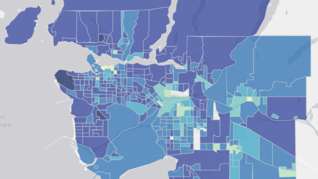 A map created as part of an extensive study from UBC shows life expectancy averages by neighbourhood.
It's considered one of the healthiest cities in the world, but an interactive map put together by local researchers shows just how much a Vancouver resident's lifespan can vary by neighbourhood.
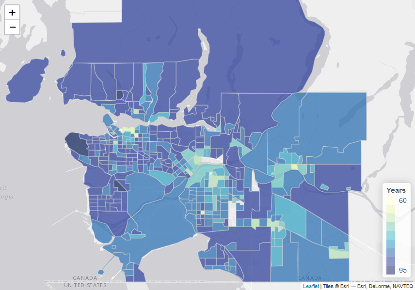
The map, published as a result of a University of British Columbia study, allows users to zoom into their own neighbourhood in Vancouver and surrounding cities, and view the average life expectancy based on census results.
For example, looking at 2016 census data, the mean life expectancy in an area that includes Vancouver's Downtown Eastside is quite low, at 60.7 years.
But in the area of the city that includes the UBC endowment lands, the mean age is just over 90.
And this filter shows how life expectancies in the region overall were much lower in 1991, than above in 2016.
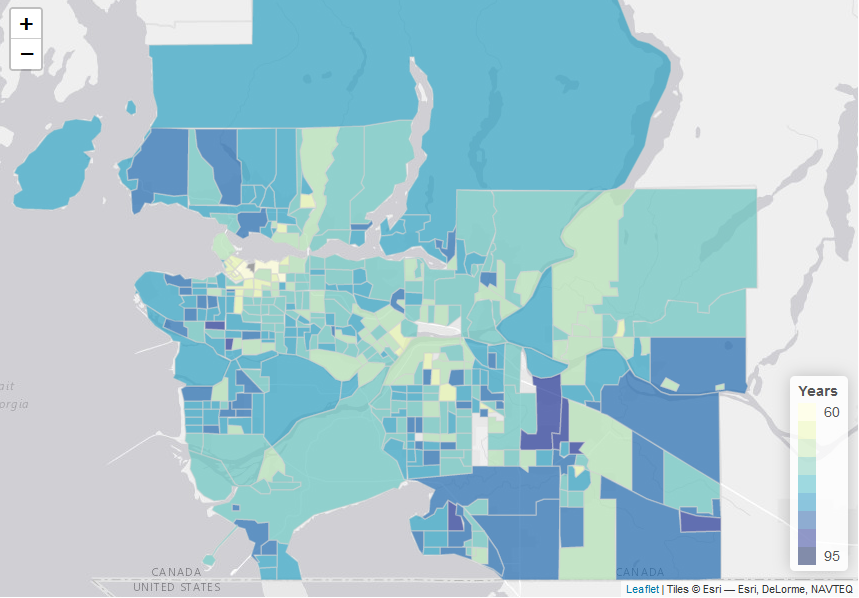
It's perhaps not surprising that overall life expectancy has increased over the period examined in the study, but it may be a surprise to see that while it's much higher in many parts of Metro Vancouver now, areas including the Downtown Eastside and Haney, in Maple Ridge, still have a life expectancy of less than 75.
"Statistically, residents of those areas have life expectancies that are comparable to the average life expectancies in Indonesia (71.8 years) and Russia (73.2 years)," UBC said in a statement.
In areas like West Vancouver, West Point Grey, northwest Richmond and South Surrey, the expectancy is much higher.
The school said it's the first study of its kind in Canada – the first to analyze life expectancy and causes of death at such a level over decades.
Users can not only check the average life expectancy in their neighbourhood according to the most recent census data (2016), but they can also look back at how it's changed, with data from 1991, 1996, 2001, 2006 and 2011.
UBC attributes some of the disparity to specific causes of death, including HIV/AIDS and sexually transmitted diseases.
"For these causes, some neighbourhoods had a mortality rate 17 times higher than others in the city," the school said.
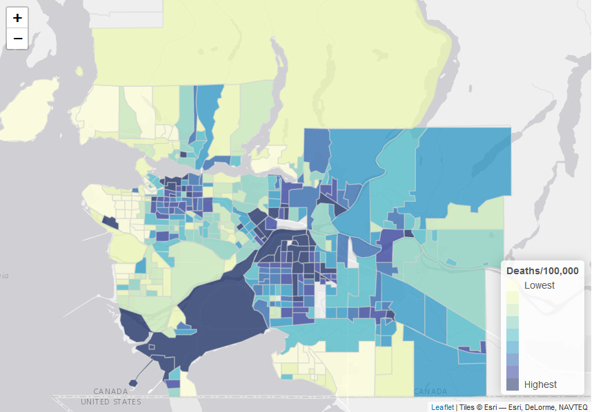
In a separate tab, they can narrow those results in another way, sorting by census year and even cause of death. The map allows users to look at the region in terms of death attributed to substance use, for example.
The image embedded below shows substance use disorder deaths per 100,000 residents, with the darkest-coloured areas having the highest rates of death, based on 2016 data.

This view of the map shows rates of death due to diabetes and kidney diseases.
More information is available on UBC's website.
All graphics are from the interactive data map created by UBC.
CTVNews.ca Top Stories

Trudeau's 2024: Did the PM become less popular this year?
Justin Trudeau’s numbers have been relatively steady this calendar year, but they've also been at their worst, according to tracking data from CTV News pollster Nik Nanos.
Manhunt underway after woman, 23, allegedly kidnapped, found alive in river
A woman in her 20s who was possibly abducted by her ex is in hospital after the car she was in plunged into the Richelieu River.
Toronto firefighters rescue man who fell into sinkhole in Yorkville
A man who fell into a sinkhole in Yorkville on a snowy Friday night in Toronto has been rescued after being stuck in the ground for roughly half an hour.
Wild boar hybrid identified near Fort Macleod, Alta.
Acting on information, an investigation by the Municipal District of Willow Creek's Agricultural Services Board (ASB) found a small population of wild boar hybrids being farmed near Fort Macleod.
Summer McIntosh makes guest appearance in 'The Nutcracker'
Summer McIntosh made a splash during her guest appearance in The National Ballet of Canada’s production of 'The Nutcracker.'
Death toll in attack on Christmas market in Germany rises to 5 and more than 200 injured
Germans on Saturday mourned both the victims and their shaken sense of security after a Saudi doctor intentionally drove into a Christmas market teeming with holiday shoppers, killing at least five people, including a small child, and wounding at least 200 others.
Overheated immigration system needed 'discipline' infusion: minister
An 'overheated' immigration system that admitted record numbers of newcomers to the country has harmed Canada's decades-old consensus on the benefits of immigration, Immigration Minister Marc Miller said, as he reflected on the changes in his department in a year-end interview.
30 people die in a crash between a passenger bus and a truck in Brazil
A crash between a passenger bus and a truck early Saturday killed 30 people on a highway in Minas Gerais, a state in southeastern Brazil, officials said.
Back on air: John Vennavally-Rao on reclaiming his career while living with cancer
'In February, there was a time when I thought my career as a TV reporter was over,' CTV News reporter and anchor John Vennavally-Rao writes.


