
Vancouver City Council has voted to scrap a widely criticized new wordmark just 10 weeks after its rollout was approved.
Councillors voted Tuesday in favour of a motion put forth by Mayor Gregor Robertson, which suggested the city go back on its Feb. 22 decision and halt the use of the controversial design.
The decision followed outcry from the public and from the design community over a logo those outside of City Hall first became aware of when council voted in favour of its rollout. The already-designed wordmark was revealed in a city staff report, as was its font, available on Microsoft Word, and its $8,000 price tag.
The motion suggested that city staff should instead work with the B.C. chapter of Graphic Designers of Canada – the country's national certification body for graphic communication and design – to come up with new options, which would then be put to the public for an online vote in the fall.
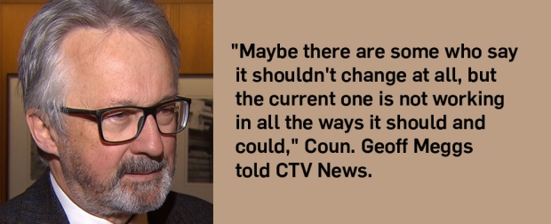
Vision Vancouver Coun. Geoff Meggs supported the motion, saying the design revealed in February didn't make him "wild with enthusiasm," but that the city does need a new logo.
"The current one is not working in all the ways it should and could," he told CTV News on Tuesday.
He said he understood why the logo was unpopular with the public, but that it will be difficult to reach a consensus.
"It's like changing the national flag. Practically everybody's going to have an opinion."
Meggs added that, when a design is selected, its implementation would be cheaper than members of the public think, and that paying a good designer to do a great job is more expensive.
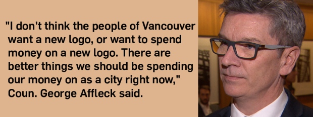
But Non-Partisan Coun. George Affleck, who disagreed from the beginning that a new logo was needed, said the mayor missed an opportunity to put the now months-long discussions to bed.
"Let's just stop this. Stay with the logo we have and more on to more important, pressing issues that the people of this city, the taxpayers of this city, want us to deal with," he said ahead of the vote.
Calling the logo chosen earlier this year "quite bland," he said there were more important things on which the city should be spending taxpayer.
Instead, Robertson should have put forward a motion suggesting the city drop the new logo, go back to the previous design and move on, Affleck said.
"We're going to spend all this time and energy and staff costs and implementation costs… That is completely unnecessary and very disappointing."
Still, the motion was approved on Tuesday afternoon. Eight voted in favour of consulting with designers and the public on a new version, while three voted that they wanted to keep the original.
There is no word on what the consultation and vote will cost taxpayers.
NPA Coun. Melissa De Genova voiced her concerns in council, saying she thinks the costs will be "astronomical."
De Genova, who voiced concerns about spending in February, again brought up that the cost is more than just the process itself, but also includes new vehicle decals, signs and massive amounts of paper products.
She mentioned specifically the signs located at major entry points into Vancouver welcoming people into the city, which staff said cost about $25,000 each to replace. When De Genova brought the same issue up weeks ago, the city's director of corporate communications estimated there were about six of those signs.
The total cost of replacing just those signs would be about $150,000, De Genova said.
"I have some experience working in marketing and usually when you do a rollout you try and do it all at once so it's not confusing," she said.
City staff said previously that large items like signs will be replaced, but only as they are worn out, as they would have been regardless of whether the logo changed.
While the price of the initial redesign was relatively low for a government contract, many were bothered by what the city received for the money: a simplified blue and green design using a font available in Microsoft Word.
The design was many put forward by the lowest bidder for the contract, local firm Hangar 18 Creative. It uses in Pantone 363 for green letters saying "City of," and Pantone 2945 for the blue "Vancouver." The font is Gotham.
Meant for use on city signs, vehicles, paper products and other city-branded items, there are also black and white versions for when full colour isn't an option.
The approved wordmark was polarizing, with many criticizing its simplicity – something the city requested of the designer in hopes that the chosen wordmark would be legible even in a small format, like on a cellphone.
The reason the city decided to change its wordmark in the first place, staff said, was the stylized lotus and narrow lettering made it hard to read on small screens.
While city staff felt the design they'd selected gave them the most flexibility, and some said they liked the bolder, cleaner logo, others were not impressed by the results. One person told CTV News at the time that their eight-year-old child could have come up with a similar idea.
It was also under fire for its similarity to the logo currently used by the City of Chilliwack, a design using the same font and text alignment, but which uses different colours and a small illustration of a mountain range.

Members of the public spoke out on social media, writing to the media and city staffers with criticisms about the amount spent, logo chosen and whether a new design was even needed. Others were bothered that although the logo's rollout wasn't approved until Feb. 22, it was actually in use at least a week before council approval on pamphlets, business cards and envelopes.
Their voices were joined by those from the design community, many of whom felt that the process was a missed opportunity.
Designer Marie Lamouret, who works at Skyrocket Digital, called the wordmark uninspiring.
"It was pretty bland, but mostly what I didn't like was that they didn't explain the reason they chose that," she said.
Dozens of people identifying themselves as members of Vancouver's design and digital community added their names to an open letter to the city published by art director Brock Ellis.
The letter, addressed to the mayor and council, said signees were "deeply disappointed" in the city's decision to reduce the selection of a new brand to "an administrative communications exercise."
They said staff "severely failed to produce an inspirational mark" that represents Vancouver.
Designers also wrote that they were troubled by the decision to go with the lowest bidder, and by the project's low budget and lack of comprehensive plan for the logo's rollout.
With files from CTV Vancouver's Shannon Paterson


